Worksheet 3 📊#
Visualization and the bootstrap
—TODO your name here
Collaboration Statement
TODO brief statement on the nature of your collaboration.
TODO your collaborator’s names here
Learning Objectives#
Become familiar with
seabornandmatplotlibfor visualizing dataLearn to use
ipywidgetsfor creating interactive plotsDevelop an intuition for bootstrap sampling
Read and reflect on a real-world case study using the causal roadmap
1. Seaborn and Matplotlib [1.5 pts]#
matplotlib and seaborn are two of the most popular libraries for creating visualizations in Python, with seaborn being a higher-level library built on top of matplotlib. We’ll use seaborn whenever possible, but to have the greatest degree of contol over your visualizations, it is important to also understand the fundamentals of matplotlib.
We’ll explore both libraries in this worksheet through an exploration of the Gapminder dataset of GDP and life expectancy across countries.
The following official resources are good starting references for both libraries. Read through the sections as indicated in the reading notes below.
Reading notes
If you are new to matplotlib, I would suggest reading “A simple example,” “Parts of a figure,” and “Coding style” sections of the matplotlib quickstart, trying out the code examples in a cell below, and using the rest of the guide as reference for when you need to customize your plots.
In particular, the “Coding style” section is useful for understanding matplotlib examples that differ based on whether they are using the “object-oriented” or “pyplot” approach.
From the seaborn plotting overview, we will primarily be using axes-level functions as opposed to the figure-level functions in order for more seamless integration with the matplotlib API.
Also note that the seaborn axes-level function examples use the object-oriented approach to matplotlib where figure
fand axesaxsobjects are explicitly created.
From the seaborn data structures reference: the “Long-form vs. wide-form data” section will be most useful. The data we will be working with in the course will primarily be in the “long” format, where each variable is a column and each observation is a row. Thus we’ll frequently be using the
data,x,y, andhueparameters in our seaborn functions.
First let’s import both seaborn and matplotlib using their standard import idioms along with pandas and numpy:
import pandas as pd
import numpy as np

# standard import aliases for seaborn and matplotlib
import seaborn as sns
import matplotlib.pyplot as plt

# TODO try out code examples in the documentation here
Next, we’ll load in the gapminder dataset of GDP and life expectancy across countries. Below are dsecriptions of the columns in the dataset:
country- The countrycontinent- The continent the country is inyear- The year data was collected. Ranges from 1952 to 2007 in increments of 5 yearslifeExp- Life expectancy at birth, in yearspop- PopulationgdpPercap- GDP per capita (US$, inflation-adjusted)
# load the gapminder dataset and peek at its columns
gapminder_df = pd.read_csv("~/COMSC-341CD/data/gapminder.csv")
gapminder_df.head()
| country | continent | year | lifeExp | pop | gdpPercap | |
|---|---|---|---|---|---|---|
| 0 | Afghanistan | Asia | 1952 | 28.801 | 8425333 | 779.445314 |
| 1 | Afghanistan | Asia | 1957 | 30.332 | 9240934 | 820.853030 |
| 2 | Afghanistan | Asia | 1962 | 31.997 | 10267083 | 853.100710 |
| 3 | Afghanistan | Asia | 1967 | 34.020 | 11537966 | 836.197138 |
| 4 | Afghanistan | Asia | 1972 | 36.088 | 13079460 | 739.981106 |
1.1. Provide an example of a causal question that could be asked with the variables in the dataset.
Your Response: TODO
Note
The gapminder dataset is an example where we have multiple observations per sample over time, as opposed to having a single observation per sample. We’ll learn about causal study designs that can be used to handle time series data in the second half of the course.
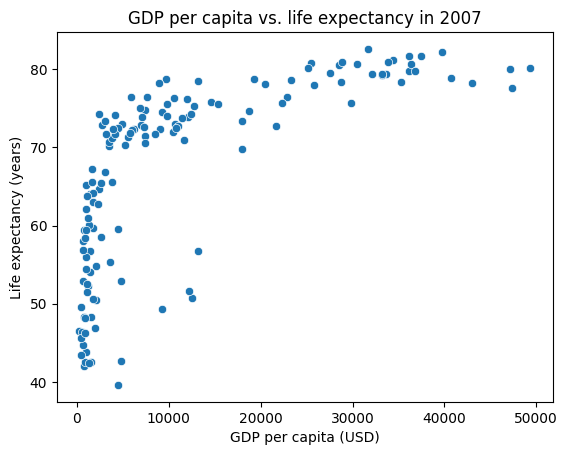
Seaborn has tight integration with pandas, which allows us to use pandas to filter and manipulate the data before passing it to seaborn. Let’s generate a sns.scatterplot of GDP per capita vs. life expectancy in the year 2007.
# select out the data for the year 2007
gapminder_2007_df = gapminder_df[gapminder_df['year'] == 2007]

# Notice how we can use the `data` parameter to pass in the dataframe, and the `x` and `y` parameters to specify the columns to plot.
sns.scatterplot(data=gapminder_2007_df, x="gdpPercap", y="lifeExp")
plt.title("GDP per capita vs. life expectancy in 2007")
plt.xlabel("GDP per capita (USD)")
plt.ylabel("Life expectancy (years)")
plt.show()
Note
Be sure to follow the basics of good figure design when creating your plots, which includes having a title, axis labels with units, and a legend.
Additionally, many seaborn plots take a hue parameter, which allows us to group the plots by a column in our dataframe and color them differently – this is analogous to the groupby operation in pandas. Let’s color the points by continent.
# The alpha parameter controls the transparency of the points, which is useful for seeing overlapping data.
sns.scatterplot(data=gapminder_2007_df, x="gdpPercap", y="lifeExp", hue="continent", alpha=0.5)
plt.title("GDP per capita vs. life expectancy in 2007")
plt.xlabel("GDP per capita (USD)")
plt.ylabel("Life expectancy (years)")
plt.show()
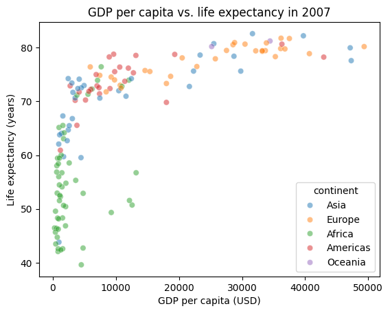
This pattern of passing in a dataframe via data, specifying the columns to plot via x and y is common across seaborn functions.
1.2. Generate a sns.lineplot of life expectancy over time for three countries of your choice, where the lines are colored by country.
# TODO your code here

# three countries to plot
countries = []
We’ll also frequently visualize the shape or distribution of a variable through histograms or kernel density estimates (kde plots). Seaborn again provides convenient functions for this.
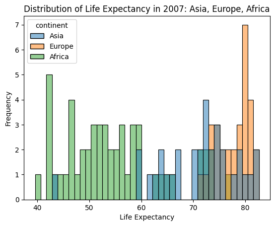
Let’s again look at the 2007 data, but now examine the distribution of life expectancy for three continents through a sns.histplot. Here the y-axis will be the frequency of data points in a discrete number of bins. Experiment with the bins parameter, which controls the number of bins to use in the histogram, to see how it affects the ease of visualizing the different distributions.
continent_2007_df = gapminder_2007_df[gapminder_2007_df['continent'].isin(['Asia', 'Europe', 'Africa'])]
# Notes that we only need to specify the x parameter, as the y-axis data count
# TODO experiment with the lower and higher values of the bins parameter.
# Do different settings make it easier or harder to see the shape of the distribution?
sns.histplot(data=continent_2007_df, x="lifeExp", hue="continent", bins=40)
plt.title("Distribution of Life Expectancy in 2007: Asia, Europe, Africa")
plt.xlabel("Life Expectancy")
plt.ylabel("Frequency")
plt.show()
It is a little difficult to see the shape of the distribution with the bins overlaid on top of each other, so let’s use a sns.kdeplot to produce an another view on the data. KDE plots visualize the distribution of observations, much like a histogram, but apply a smoothing transformation to make the shape of the distribution easier to see.
1.3. Create a kde plot for the life expectancy of the three continents below, using the same parameters as the histogram above, except omit the bins parameter:
# TODO your code here
1.4. Briefly describe differences that you observe between the distributions of life expectancy for the three continents. Some questions to consider:
Around what values are the peaks of the distributions (central tendency)?
Do some of the distributions seem more or less spread out than others (variability)?
Do any of the distributions seem to have multiple peaks (multimodality)?
Do any of the distributions seem to have “tails” where there are fewer observations at relatively extreme values for the continent?
Your Response: TODO
1.5 We’ve explored two of the three types of plotting functions that seaborn provides:
Let’s now explore the third type of plotting function in an more open-ended way. Pick a seaborn plotting function that can be used to visualize categorical data, linked below:
In your response, briefly describe the functionality of the plotting function you chose, and give an descriptive question that you could answer with the plot. Then, generate a plot of your choice using the function, and describe what the plot is revealing about the data.
Categorical variables in the dataset:
countrycontinentyear(can be used as a categorical variable, depending on the question we want to ask!)
Continuous variables in the dataset:
lifeExppopgdpPercap
Your Response: TODO
# TODO your categorical plot code here
2. The bootstrap technique [1 pt]#
Here, we’ll explore the bootstrap technique, which is a powerful technique for helping us quantify uncertainty in any estimates we produce from our data.
The goal whenever we’re producing an estimate from our data is to learn something about the underyling population from which our data was sampled. These statistics, like the estimated expectations we’ve been calculating, tell us something about the population. For example, suppose we’re healthcare policy analysts trying to understand the average cholesterol levels in the US adult population. In an ideal world, we would measure the cholesterol level of every person in the US – but that is not practical. Instead, we collect a smaller sample of people, and calculate the average cholesterol level in our sample. Here, we’ll be re-using the NHANES dataset from last worksheet as our cholesterol sample:
from nhanes.load import load_NHANES_data

nhanes_df = load_NHANES_data()

# filter to adults, and only include those with a valid cholesterol measurement
cholesterol_df = nhanes_df[nhanes_df['AgeInYearsAtScreening'] >= 18]
cholesterol_df = cholesterol_df[cholesterol_df['TotalCholesterolMgdl'].notna()][['AgeInYearsAtScreening', 'TotalCholesterolMgdl']]

cholesterol_df.shape
(5176, 2)
Since our sample of roughly 5,000 people is just one of many different samples that could have been collected, there will be some variability in the estimates we get from different samples. We’d like to quantify this variability to understand how much uncertainty there is in our estimate.
The problem is that we only have one sample. As a thought experiment however, we can imagine running our data collection process many times, each time collecting a sample of the same size from the same population. Then, we could calculate the estimate we’re interested in – here, the mean cholesterol level in U.S. adults – for each of these samples, and look at the distribution of these estimates. This distribution of estimates is called the sampling distribution of the estimate, and the shape of the sampling distribution tells us about the uncertainty in our estimate.
This thought experiment is where the bootstrap technique comes in. The bootstrap helps us understand how much our estimates might vary if we had collected different samples from the same population. To do this, we use the following procedure:
We treat our sample as if it represents the whole population
We create many new bootstrap samples by randomly selecting from our data with replacement (e.g. the same observation can be selected multiple times)
For each bootstrap sample, we calculate our estimate of interest (e.g. the mean cholesterol level)
By looking at how this estimate varies across our bootstrap samples, we can estimate our uncertainty.
As long as we generate enough bootstrap samples (which we can easily do with modern simulation tools and computing power), the bootstrap sampling distribution will give us a good approximation of the true sampling distribution of the estimate. Let’s begin by taking a look at the estimated expectation of cholesterol in our sample:
print(f"Average cholesterol in our sample: {cholesterol_df['TotalCholesterolMgdl'].mean():.1f} mg/dL")
Average cholesterol in our sample: 186.9 mg/dL
Next, we’ll implement step 2 of the bootstrap technique above. Pandas has a convenient df.sample method that we can use to generate bootstrap samples.
The following call will generate a single bootstrap sample of a dataframe:
# frac=1 means we're generating a sample of the same size as the original dataframe
# replace=True means we're sampling with replacement
bootstrap_df = df.sample(frac=1, replace=True)
2.1. Complete the function below that generates bootstrap samples of a dataframe, returning them as a list:
def generate_bootstrap_dfs(df, n_bootstraps=5000):
    """
    Bootstraps the dataframe `n_bootstraps` times, where each bootstrap sample is the same number of rows as the original dataframe.

    Args:
        df (pd.DataFrame): the dataframe to bootstrap
        n_bootstraps (int): the number of bootstraps to generate

    Returns:
        list[pd.DataFrame]: a list of bootstrapped dataframes
    """
    bootstrap_dfs = []
    # TODO your code here

    return bootstrap_dfs

# Create a simple dataframe to test
df = pd.DataFrame({'review_scores': [4, np.nan, 2, 3],
                   'review_text': ['I liked it', 'It was awful', 'Bland', 'Pretty good']})

bootstrap_dfs = generate_bootstrap_dfs(df)
assert bootstrap_dfs[0].shape == df.shape, "Each bootstrap sample should be the same size as the original dataframe"
---------------------------------------------------------------------------
IndexError                                Traceback (most recent call last)
Cell In[11], line 22
     18 df = pd.DataFrame({'review_scores': [4, np.nan, 2, 3],
     19                    'review_text': ['I liked it', 'It was awful', 'Bland', 'Pretty good']})
     21 bootstrap_dfs = generate_bootstrap_dfs(df)
---> 22 assert bootstrap_dfs[0].shape == df.shape, "Each bootstrap sample should be the same size as the original dataframe"

IndexError: list index out of range
# Generate 5000 bootstrap samples of the cholesterol dataframe, may take 10-15 seconds to run
# TODO your code here
bootstrap_cholesterol_dfs = []
2.2. Next, we’ll perform step 3 of the bootstrap technique above, calculating the estimated expectation (mean) cholesterol level for each bootstrap sample:
def generate_bootstrap_means(bootstrap_dfs, column):
    """
    Calculates the mean of a column for each bootstrap sample in a list of dataframes.

    Args:
        bootstrap_dfs (list[pd.DataFrame]): a list of bootstrapped dataframes
        column (str): the column to calculate the mean of

    Returns:
        list[float]: a list of means (estimated expectations)
    """
    # TODO your code here
    return []
# TODO your code here
bootstrap_cholesterol_means = []
We can then visualize the shape of our bootstrap sampling distribution. Create a sns.histplot of the bootstrap means below, where the x parameter is the list of bootstrap means and the kde parameter is set to True to visualize the shape of the distribution:
# TODO your code here
You’ll notice that the sampling distribution is approximately bell-shaped (Normal distribution), which is a property of the bootstrap sampling distribution when the original sample is large and representative of the population. This then allows us to use the bootstrap sampling distribution to understand how much uncertainty there is in our estimate of average cholesterol level in the U.S. adult population. We can do this visually by inspecting the spread of the distribution above, and we can also quantify this by computing confidence intervals on our estimate.
You will typically see 95% confidence intervals reported in research papers. The 95% confidence interval tells us that if we repeated our sampling process many times and computed a 95% confidence interval each time, 95% of those intervals would contain the true population average cholesterol level.
2.3. To compute the 95% confidence interval, we can take the 2.5th and 97.5th percentiles of the bootstrap sampling distribution via np.percentile. Determine the 2.5th and 97.5th percentiles of the bootstrap cholesterol means below, using the a and q parameters of np.percentile:
# TODO your code here
# NOTE: the percentile function takes percentiles in the range [0, 100], not fractions
lower_ci = None
upper_ci = None

print(f"Average cholesterol level in U.S. adults: {cholesterol_df['TotalCholesterolMgdl'].mean():.1f} mg/dL")
print(f"95% Confidence Interval: [{lower_ci:.1f}, {upper_ci:.1f}] mg/dL")
The narrower the confidence interval, the more precise our estimate is (decreased uncertainty and variance). One secondary goal we have when designing and analyzing studies is to make our estimates as precise as possible. The most straightforward way to do this is to increase our sample size – but collecting more data is not often not practical! We’ll explore how sample size affects the precision of our estimates in the next section.
Takeaways
The bootstrap is a powerful technique that helps us understand uncertainty in our estimates by simulating what would happen if we could collect many different samples from the population:
Instead of collecting new samples (which is often not possible), we create new samples by resampling from our existing data
By looking at how our estimates vary across these bootstrap samples, we can understand how much uncertainty exists in our original estimate
This gives us practical tools like confidence intervals without requiring complex mathematical derivations
The wider the range of values we see in our bootstrap samples, the more uncertainty we have in our estimate
This is just a high-level overview of the bootstrap for the purposes of this course, and we’ve skipped over many theoretical properties and details. If you’re interested in learning more, let me know and I can recommend some resources!
3. Adding interactivity [1 pt]#
In this section, we’ll learn how to make our visualizations interactive using ipywidgets. These dynamic widgets can help us build intuition about how different parameters affect our analysis.
The ipywidgets library functionality is extensive, but for our visualizations it will be sufficient for us to use the interact/interact_manual decorators to add interactivity without too much extra code. Read about the interact functionality below, focusing on the first three sections: “Basic interact,” “Fixing arguments using fixed”, and “Widget abbreviations”.
Reading Notes
I suggest reading the “Basic
interact,” “Fixing arguments usingfixed”, and “Widget abbreviations” sections, and leaving the rest for reference as they contain extra functionality that aren’t as relevant to our purposes.interact_manualbehaves the exact same way asinteract, except that it requires the user to manually update the widget value by clicking on it. In all the examples below, we’ll useinteract_manualso that the widget values are not updated automatically as we change the parameters.The most concise usage of
interact/interact_manualis to use them as decorators, which will automatically create a widget for each parameter in the function. You can read more about Python decorators at this link, but for our purposes it is sufficient to know that we can use them to add interactivity to our functions by mirroring the parameter names in our plotting functions.
# standard imports for ipywidgets
from ipywidgets import interact, interact_manual, fixed
import ipywidgets as widgets

# TODO can try out code examples in the documentation here
Let’s now use the interact_manual decorator to add interactivity to our bootstrap exploration. The parameters passed to the decorator will provide a dropdown menu for each parameter in the function in the widget, which you can see in the examplewidget below:
# generate a list of sample fractions to use for the dropdown menu
sample_fracs = [0.2, 0.4, 0.6, 0.8, 1.0]

# the parameter name in the function is the same as the parameter name in the decorator
@interact_manual(sample_frac=sample_fracs)
def print_subsample_mean(sample_frac):
    print(f"Calculating mean cholesterol of a random subsample of {int(sample_frac*cholesterol_df.shape[0])} people")

    subsample = cholesterol_df.sample(frac=sample_frac)

    print(f"Average cholesterol level in U.S. adults: {subsample['TotalCholesterolMgdl'].mean():.2f} mg/dL")
3.1 Complete the function below that displays the bootstrap sampling distribution of cholesterol levels for a given sample fraction. How does the spread of the sampling distribution change as we change the sample size? Do our estimates become more or less precise as we increase the sample size?
Your Response: TODO
@interact_manual(sample_frac=sample_fracs)
def plot_bootstrap_sampling_distribution(sample_frac):

    print(f"Calculating mean cholesterol from a subsample of {int(sample_frac*cholesterol_df.shape[0])} people")

    # TODO your code here: feel free to copy and paste from earlier parts of the worksheet

    # subsample the cholesterol dataframe
    subsample_df = None

    # generate bootstrap samples from the subsampled dataframe
    # NOTE: you can use n_bootstraps=1000 to speed up the simulation
    bootstrap_dfs = None

    # calculate the bootstrap means
    bootstrap_cholesterol_means = None

    # Print the subsample mean and confidence interval
    lower_ci = None
    upper_ci = None
    print(f"Average cholesterol level in U.S. adults: {subsample_df['TotalCholesterolMgdl'].mean():.2f} mg/dL")
    print(f"95% Confidence Interval: [{lower_ci:.1f}, {upper_ci:.1f}] mg/dL")

    # plot the bootstrap sampling distribution using sns.histplot

    # NOTE: this fixes the x-axis limits to be the same for all plots, making it easier to compare
    plt.xlim(182, 192)
    plt.show()
3.2. Next, let’s add interactivity to one of the gapminder plots we created earlier. Select one of the plots we created in question 1 and add interactivity with two parameters to your widget.
Some suggested parameters for interact_manual are listed given below as well. Describe your choices for the parameters and state another descriptive question that your widget can help answer. For example, “How does the relationship between GDP and life expectancy vary across the two selected countries in the year 2007?”
Your Response: TODO
# You can use these decorator parameters as a starting point, but feel free to change them

# all unique countries in the gapminder dataset
countries = gapminder_df['country'].unique()

# all unique continents in the gapminder dataset
continents = gapminder_df['continent'].unique()

# all unique years in the gapminder dataset
years = gapminder_df['year'].unique()

# TODO your code here
@interact_manual(param1=countries, param2=countries)
def interactive_gapminder_plot(param1, param2):
    pass
4. Causal roadmap: Cintron et al. 2021 [1 pt]#
Read “A Roadmap for Causal Inference” by Cintron et al. 2021 and answer the following questions:
Reading notes
Note on how the steps of the causal roadmap are broken out a bit more granularly than we’ve been discussing in class:
Their steps 1-2 are our “prior knowledge” step
Their step 3 is our “question” step
Their steps 4-5 are our “design” step
The key identification statement is at the end of step 1:
A critical component of the assumed causal model is that neighborhoods receiving greening were selected effectively randomly from among those that were eligible for the program; eligibility was determined by the average income of neighborhood residents; and receiving greening was otherwise unrelated to characteristics of neighborhood residents.
For a more technical walkthrough of the Causal Roadmap, see Petersen and van der Laan 2015: Causal Models and Learning from Data
4.1. State what the measured treatment \(T\) and outcome \(Y\) are in the study – be as specific as possible.
Your Response: TODO
4.2 Draw the causal graph that was detailed step 1 of the Causal Roadmap, with two of the their listed potential confounders present. Give each node a variable name (e.g. \(T\), \(Y\), \(C_1\), \(C_2\)) and indicate what each variable represents.
Your Response: TODO
Submission note
For this question, you can either hand-draw the graph on paper and submit a photo or use an online tool of your choice. Please make sure the image is submitted as a separate file on Gradescope.
Note: we haven’t discussed how to formally draw causal graphs yet. You can use the examples from the slides so far as a reference, and the graph does not need to be perfect. This exercise will prime us for class in Week 4 when we’ll be discussing causal graphs in more detail.
4.3 Are there any potential confounders (either in the authors’ list or ones you can think of) that may be difficult to measure? Briefly comment on why measuring them may be hard.
Your Response: TODO
4.4 Looking towards the interpretation of the greenery study, what population would the results be applicable to? E.g. would it be generalizable to all neighborhoods in the United States, or would it be a more specific subset?
Your Response: TODO
5. Reflection [0.5 pts]#
5.1 How much time outside of class did it take you to complete this worksheet?
Your Response: TODO
5.2 What is one thing you have a better understanding of after completing this worksheet and going through the class content this week? This could be about the concepts, the reading, or the code.
Your Response: TODO
5.3 What questions or points of confusion do you have about the material covered covered in the past week of class?
Your Response: TODO
Tip
Don’t forget to check that all of the TODOs are filled in before you submit!
Acknowledgements#
Free data from World Bank via Gapminder.org, CC-BY-4.0 license. Read more at https://www.gapminder.org/data/
Gapminder data cleaned and organized via the causaldata package, produced by Nick Huntington-Klein.
Intuition for explaining the bootstrap from Zach Duey’s blog post, Applying Nonparametric Bootstrap