Activity 10: Propensity Scores for Overlap and Balancing#
2025-10-08
import pandas as pd
import numpy as np

import matplotlib.pyplot as plt
import seaborn as sns
import statsmodels.formula.api as smf

from ipywidgets import interact_manual
from ipywidgets import widgets


rng = np.random.default_rng(42)
Part 1: Distribution of covariates under true randomization#
For the growth mindset intervention, we saw that the success_expect covariate was associated with the intervention. What should the distribution of success_expect look like under true randomization (coin flips)? And does it matter if the coin flips are “biased” (not 50% heads, 50% tails)?
First, let’s simulate a distribution of success_expect under true randomization. Begin by generating some data that represents success_expect, which takes on integer values between 1 and 7. Use the rng.choice function to generate 10,000 samples from a uniform distribution over the integers 1 through 7.
help(rng.choice)
Help on built-in function choice:

choice(...) method of numpy.random._generator.Generator instance
    choice(a, size=None, replace=True, p=None, axis=0, shuffle=True)

    Generates a random sample from a given array

    Parameters
    ----------
    a : {array_like, int}
        If an ndarray, a random sample is generated from its elements.
        If an int, the random sample is generated from np.arange(a).
    size : {int, tuple[int]}, optional
        Output shape.  If the given shape is, e.g., ``(m, n, k)``, then
        ``m * n * k`` samples are drawn from the 1-d `a`. If `a` has more
        than one dimension, the `size` shape will be inserted into the
        `axis` dimension, so the output ``ndim`` will be ``a.ndim - 1 +
        len(size)``. Default is None, in which case a single value is
        returned.
    replace : bool, optional
        Whether the sample is with or without replacement. Default is True,
        meaning that a value of ``a`` can be selected multiple times.
    p : 1-D array_like, optional
        The probabilities associated with each entry in a.
        If not given, the sample assumes a uniform distribution over all
        entries in ``a``.
    axis : int, optional
        The axis along which the selection is performed. The default, 0,
        selects by row.
    shuffle : bool, optional
        Whether the sample is shuffled when sampling without replacement.
        Default is True, False provides a speedup.

    Returns
    -------
    samples : single item or ndarray
        The generated random samples

    Raises
    ------
    ValueError
        If a is an int and less than zero, if p is not 1-dimensional, if
        a is array-like with a size 0, if p is not a vector of
        probabilities, if a and p have different lengths, or if
        replace=False and the sample size is greater than the population
        size.

    See Also
    --------
    integers, shuffle, permutation

    Notes
    -----
    Setting user-specified probabilities through ``p`` uses a more general but less
    efficient sampler than the default. The general sampler produces a different sample
    than the optimized sampler even if each element of ``p`` is 1 / len(a).

    Examples
    --------
    Generate a uniform random sample from np.arange(5) of size 3:

    >>> rng = np.random.default_rng()
    >>> rng.choice(5, 3)
    array([0, 3, 4]) # random
    >>> #This is equivalent to rng.integers(0,5,3)

    Generate a non-uniform random sample from np.arange(5) of size 3:

    >>> rng.choice(5, 3, p=[0.1, 0, 0.3, 0.6, 0])
    array([3, 3, 0]) # random

    Generate a uniform random sample from np.arange(5) of size 3 without
    replacement:

    >>> rng.choice(5, 3, replace=False)
    array([3,1,0]) # random
    >>> #This is equivalent to rng.permutation(np.arange(5))[:3]

    Generate a uniform random sample from a 2-D array along the first
    axis (the default), without replacement:

    >>> rng.choice([[0, 1, 2], [3, 4, 5], [6, 7, 8]], 2, replace=False)
    array([[3, 4, 5], # random
           [0, 1, 2]])

    Generate a non-uniform random sample from np.arange(5) of size
    3 without replacement:

    >>> rng.choice(5, 3, replace=False, p=[0.1, 0, 0.3, 0.6, 0])
    array([2, 3, 0]) # random

    Any of the above can be repeated with an arbitrary array-like
    instead of just integers. For instance:

    >>> aa_milne_arr = ['pooh', 'rabbit', 'piglet', 'Christopher']
    >>> rng.choice(aa_milne_arr, 5, p=[0.5, 0.1, 0.1, 0.3])
    array(['pooh', 'pooh', 'pooh', 'Christopher', 'piglet'], # random
          dtype='<U11')
n_samples = 10000
sim_success_expect = rng.choice(a=np.arange(1, 8), size=n_samples)
Next, generate random treatment assignments for each sample using the rng.choice function. For now, assume the probability of treatment is 0.5, that is:
p_treat = 0.5
# p needs to be a list of probabilities for each outcome: [0, 1]
p = [1-p_treat, p_treat]
sim_treat = rng.choice(a=[0, 1], size=n_samples, p=p)
Let’s now plot the distribution of treatment for each sim_success_expect level. We’ll do this by creating a dataframe with the two columns sim_success_expect and sim_treat, and then using sns.barplot to plot the distribution of sim_treat for each sim_success_expect level.
Call sns.barplot with the x and y parameters set to sim_success_expect and sim_treat, respectively.
sim_df = pd.DataFrame({
    'sim_success_expect': sim_success_expect,
    'sim_treat': sim_treat
})

sim_df.head()
# TODO sns.barplot
sns.barplot(x='sim_success_expect', y='sim_treat', data=sim_df)
# TODO horizontal line corresponding to p_treat
plt.axhline(y=p_treat, label="true probability of treatment", color="red")
<matplotlib.lines.Line2D at 0x33b2f7410>
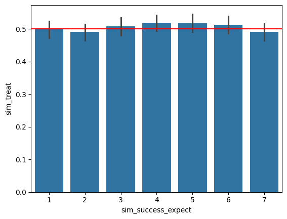
The black vertical lines on each bar represnt a bootstrapped confidence interval for the proportion of treatment in each sim_success_expect level. On your plot above, add a horizontal line using plt.axhline at y=p_treat to represent the true probability of treatment. The observed probability of treatment shouldn’t deviate significantly from the true probability of treatment for any of the sim_success_expect values.
Finally, let’s explore different different probabilities of treatment. Copy your code from the above three cells that created your barplot into the plot_treatment_distribution function below, and add an interact_manual decorator that lets you change p_treat.
Does the probability of treatment change the distribution of treated units among the sim_success_expect values?
# TODO an interact_manual
@interact_manual(p_treat=np.arange(0, 1, 0.1))
def plot_treatment_distribution(p_treat):
    n_samples = 10000
    sim_success_expect = rng.choice(a=np.arange(1, 8), size=n_samples)
    p = [1-p_treat, p_treat]
    sim_treat = rng.choice(a=[0, 1], size=n_samples, p=p)

    sim_df = pd.DataFrame({
    'sim_success_expect': sim_success_expect,
    'sim_treat': sim_treat
    })

    sim_df.head()
    # TODO sns.barplot
    sns.barplot(x='sim_success_expect', y='sim_treat', data=sim_df)
    # TODO horizontal line corresponding to p_treat
    plt.axhline(y=p_treat, label="true probability of treatment", color="red")
Part 2: Fitting a Propensity Score#
Let’s now estimate a propensity score for the learning mindsets data. As a reminder from Monday’s lecture, the columns we’ll look at are:
intervention: whether the student received the intervention (1) or not (0)success_expect: student prior mindset about their ability to succeed in school (higher values indicate a stronger belief in their ability to succeed)frst_in_family: whether the student would be the first in their family to attend college (1) or not (0)gender: student’s self-reported genderschool_urbanicity: categorical variable corresponding to the urbanicity of the school the student attends, e.g. urban, suburban, ruralachievement_score: the student’s future grade achievement, standardized such that 0 is the mean and it has a standard deviation of 1
The way we’ll do this is by fitting a logistic regression model, which allows us estimate the following:
Like with linear regression, this can extend to multiple covariates, such as:
In statmodels, we just need to specify the formula string 'T ~1 + X1 + X2 + X3 + X4' and pass the dataframe to smf.logit instead of smf.ols to fit a logistic regression model:
model = smf.logit('T ~ 1 + X1 + X2 + X3 + X4', data=data).fit()
Fit a propensity score model predicting intervention and our four covariates from Tuesday’s lecture (success_expect, gender, frst_in_family, school_urbanicity).
One additional consideration is that gender and school_urbanicity are categorical variables. We can indicate to smf.logit that these variables are categorical by wrapping the variables in C() in the formula string. For example, if we wanted to fit a model with X1 and X2 as categorical variables, we would write:
model = smf.logit('T ~ 1 + C(X1) + C(X2) + X3 + X4', data=data).fit()
# load the learning_mindset data again
learning_df = pd.read_csv("~/COMSC-341CD/data/learning_mindset.csv")
# TODO fit a propensity score model
formula = 'intervention ~ 1 + success_expect + frst_in_family + C(gender) + C(school_urbanicity)'
propensity_model = smf.logit(formula=formula, data=learning_df).fit()
#propensity_model = smf.logit(formula=formula, data=learning_df).fit()
Optimization terminated successfully.
         Current function value: 0.628017
         Iterations 5
We can then add the predicted propensity scores as a column to analyze along with the rest of the data. Run the cell below to generate predicted propensity scores and add them to the learning_df:
pred_propensity_scores = propensity_model.predict(learning_df)
learning_df['propensity_score'] = pred_propensity_scores
A quick check for whether we’ve fit the propensity score correctly is to verify that the average propensity score is equal to the probability of treatment in the dataset:
p_treat = learning_df['intervention'].mean()

assert np.isclose(learning_df['propensity_score'].mean(), p_treat, atol=0.01), "The average propensity score is not equal to the probability of treatment"
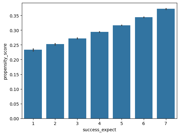
Propensity score give us a lot of flexibility in visualizing confounding issues. For example, we can generate the same barplot we made in part 1 with success_expect on the x-axis, but with the propensity_score on the y-axis for our learning_df dataset.
What do you observe about the relationship between success_expect and propensity_score?
Your response: pollev.com/tliu
# TODO a barplot of x=success_expect vs y=propensity_score
sns.barplot(x='success_expect', y='propensity_score', data=learning_df)
<Axes: xlabel='success_expect', ylabel='propensity_score'>
Part 3: Propensity scores for exploring covariate distribution#
In Project 1, we’re plotting the distribution of covariates of treated and control units to visually verify that the covariates were balanced between the two groups.
The propensity score is a convenient way check whether all the covariates we want to control for are balanced between the two groups.
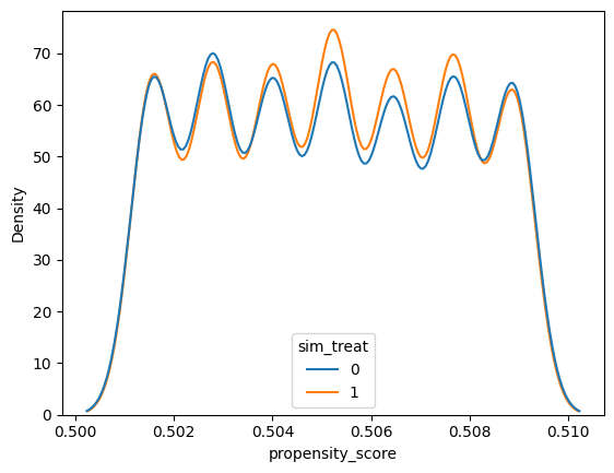
Run the cell below to fit a propensity score model for our simulated data from Part 1. Then plot the distribution of propensity scores for the treated and control units by creating a sns.kdeplot with the x-axis as the propensity_score and the hue as the sim_treat variable – optionally setting cumulative=True to plot the cumulative distribution. The distributions should approximately match since we simulated a randomized experiment:
sim_propensity_model = smf.logit('sim_treat ~ 1 + sim_success_expect', data=sim_df).fit()
sim_propensity_scores = sim_propensity_model.predict(sim_df)
sim_df['propensity_score'] = sim_propensity_scores

# TODO kdeplot
sns.kdeplot(x='propensity_score', hue='sim_treat', data=sim_df)
Optimization terminated successfully.
         Current function value: 0.693081
         Iterations 3
<Axes: xlabel='propensity_score', ylabel='Density'>
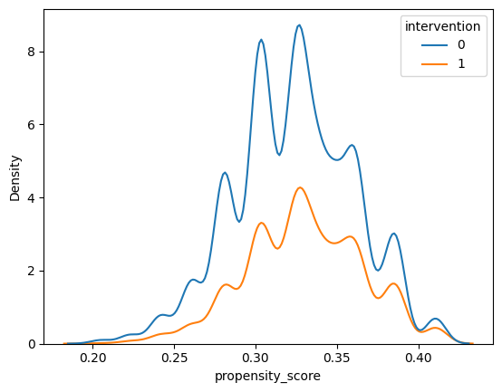
Now, create the same plot for our learning_df dataset, setting the hue to intervention and x to propensity_score.
Differences in the distributions suggest that the covariates are not balanced between the two groups – in other words, there is confounding among the covariates we’ve included in the propensity score model.
sns.kdeplot(x='propensity_score', data=learning_df, hue='intervention')
<Axes: xlabel='propensity_score', ylabel='Density'>
sns.histplot(x='propensity_score', data=learning_df, hue='intervention', multiple='stack')
<Axes: xlabel='propensity_score', ylabel='Count'>
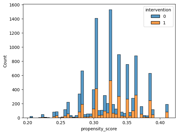
This type of density plot of the propensity score also allows us to check positivity – if there are regions of the propensity score where there are only treated or only control units, then there is a positivity violation.
Does there appear to be any obvious regions where there are only treated or only control units? What about regions where there are few treated or control units?
Your response: pollev.com/tliu
Part 4: Propensity scores as a balancer#
Now that we have the propensity score distilling high-dimensional covariates into a single number, binning the data by the propensity score becomes a viable strategy for balancing the covariates.
Run the cell below to bin the data by the propensity score using the pd.cut function, producing a new column propensity_score_bin in the learning_df dataframe.
n_bins = 5
learning_df['propensity_score_bin'] = pd.cut(learning_df['propensity_score'], bins=n_bins)

# view the bins created by pd.cut
print(learning_df['propensity_score_bin'].unique())
[(0.287, 0.329], (0.245, 0.287], (0.329, 0.371], (0.371, 0.412], (0.203, 0.245]]
Categories (5, interval[float64, right]): [(0.203, 0.245] < (0.245, 0.287] < (0.287, 0.329] < (0.329, 0.371] < (0.371, 0.412]]
Then, perform a groupby with by='[propensity_score_bin', 'intervention'], and calculate the mean of the given columns on the grouped data.
Are there any of the columns that are significantly different between the \(T=1\) and \(T=0\) groups for each propensity score bin? If so, how do you interpret this?
Your response: pollev.com/tliu
# TODO group by propensity score bin and intervention, and calculate the mean of the columns on the grouped data
columns = ['success_expect', 'frst_in_family', 'school_urbanicity', 'gender', 'achievement_score']
learning_df.groupby(by=['propensity_score_bin', 'intervention'])[columns].mean()
/var/folders/92/j4ms2q355sv0n3q55bgv_hwm0000gn/T/ipykernel_76377/648158888.py:3: FutureWarning: The default of observed=False is deprecated and will be changed to True in a future version of pandas. Pass observed=False to retain current behavior or observed=True to adopt the future default and silence this warning.
  learning_df.groupby(by=['propensity_score_bin', 'intervention'])[columns].mean()
| success_expect | frst_in_family | school_urbanicity | gender | achievement_score | ||
|---|---|---|---|---|---|---|
| propensity_score_bin | intervention | |||||
| (0.203, 0.245] | 0 | 1.966667 | 0.988889 | 2.294444 | 1.766667 | -0.855587 |
| 1 | 1.950000 | 0.983333 | 2.516667 | 1.816667 | -0.671004 | |
| (0.245, 0.287] | 0 | 4.013749 | 0.957837 | 2.274977 | 1.726856 | -0.766884 |
| 1 | 3.984694 | 0.954082 | 2.283163 | 1.709184 | -0.434164 | |
| (0.287, 0.329] | 0 | 5.213038 | 0.876008 | 2.446909 | 1.530242 | -0.258401 |
| 1 | 5.270698 | 0.883369 | 2.436285 | 1.521238 | 0.164735 | |
| (0.329, 0.371] | 0 | 5.704668 | 0.278133 | 2.444226 | 1.445209 | 0.077631 |
| 1 | 5.706571 | 0.274527 | 2.454545 | 1.452745 | 0.489200 | |
| (0.371, 0.412] | 0 | 6.533793 | 0.180690 | 2.706207 | 1.110345 | 0.722760 |
| 1 | 6.500000 | 0.148148 | 2.696759 | 1.097222 | 1.194055 |