Activity 13 Solution: RDDs#
2025-04-08
import numpy as np
import matplotlib.pyplot as plt
import pandas as pd
import seaborn as sns
import statsmodels.formula.api as smf
gov_transfers = pd.read_csv("~/COMSC-341CD/data/gov_transfers.csv")
The columns we have in the dataset are:
\(R\)
Income_Centered: the predicted income of the household, centered at 0\(T\)
Participation: whether the household participated in the poverty alleviation program\(Y\)
Support: the amount of goverment support, encoded as a survery question:In relation to the previous government, do you believe that the current government is worse (0), the same (1/2), better (1)?
gov_transfers.head()
| Income_Centered | Participation | Support | |
|---|---|---|---|
| 0 | 0.006571 | 0 | 1.0 |
| 1 | 0.011075 | 0 | 1.0 |
| 2 | 0.002424 | 0 | 1.0 |
| 3 | 0.007650 | 0 | 0.5 |
| 4 | 0.010001 | 0 | 1.0 |
Part 1#
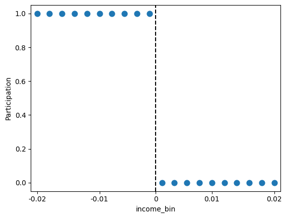
Let’s first visualize how the treatment assignment is related to the income. Use pd.cut with bins=20 and labels=False to bin the income data into 20 bins:
# TODO your code here
gov_transfers['income_bin'] = pd.cut(gov_transfers['Income_Centered'], bins=20, labels=False)
gov_transfers.head()
| Income_Centered | Participation | Support | income_bin | |
|---|---|---|---|---|
| 0 | 0.006571 | 0 | 1.0 | 13 |
| 1 | 0.011075 | 0 | 1.0 | 15 |
| 2 | 0.002424 | 0 | 1.0 | 11 |
| 3 | 0.007650 | 0 | 0.5 | 13 |
| 4 | 0.010001 | 0 | 1.0 | 15 |
Next, generate a sns.pointplot of y=Participation vs x=income_bin. Set linestyle='none' to plot the points individually.
Discuss with folks around you: Do you observe any deviations from the policy of assigning participation in the transfer program based on income? Does this suggest that the RDD is “sharp” or not?
Your response: pollev.com/tliu
# TODO your code here
sns.pointplot(x='income_bin', y='Participation', data=gov_transfers, linestyle='none')
# convert the xticks to the same units as the original income data
plt.xticks(ticks=[0, 5, 9.5, 14, 19], labels=[-0.02, -0.01, 0, 0.01, 0.02])
# plot the cutoff as a vertical line
plt.axvline(x=9.5, color='black', linestyle='--', label='Income cutoff')
<matplotlib.lines.Line2D at 0x348fc8710>
Part 2#
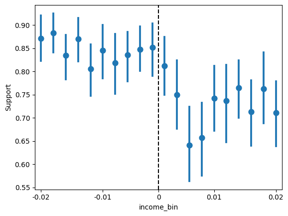
Now we’ll look at the outcome variable, Support. Generate a sns.pointplot of y=Support vs x=income_bin. Set linestyle='none' to plot the points individually.
# TODO your code here
sns.pointplot(x='income_bin', y='Support', data=gov_transfers, linestyle='none')
plt.xticks(ticks=[0, 5, 9.5, 14, 19], labels=[-0.02, -0.01, 0, 0.01, 0.02])
plt.axvline(x=9.5, color='black', linestyle='--', label='Income cutoff')
<matplotlib.lines.Line2D at 0x3490ad5d0>
On Worksheet 5, we fit two linear regressions on either side of the cutoff. Another approach to estimating the average treatment effect is to fit a single linear regression that allows the slope to change at the cutoff:
Since \(c=0\), this simplifies to:
The average treatment effect at the cutoff is then given by \(\beta_2\).
# TODO your code here
rdd_formula = 'Support ~ 1 + Income_Centered + Participation + Income_Centered*Participation'
rdd_model = smf.ols(rdd_formula, data=gov_transfers).fit()
print(rdd_model.params['Participation'])
0.09985188527415872
What is your estimate of the average treatment effect at the cutoff (rounded to 1 decimal place)?
Your response: pollev.com/tliu
Acknowledgements#
This activity uses data from Nick Huntington-Klein’s causaldata package.