[Complete] Plotting and bootstrap demo#
2025-02-13
# imports we'll need
import numpy as np
import pandas as pd

import matplotlib.pyplot as plt
import seaborn as sns
0. The normal distribution#
A probability distribution that we will frequently encounter in addition to the categorical distributions we saw in worksheet 1 is the normal distribution. The normal distribution has the following properties:
centered and symmetric about the mean \(\mu\) (or \(E[X]\))
spread by the standard deviation \(\sigma\)
the variance is \(\sigma^2\) (or \(V[X]\))
We write a random variable as \(X\) that follows a normal distribution as \(X \sim \mathcal{N}(\mu, \sigma^2)\).
Tip
Watch whether the software you are using takes the variance or the standard deviation as input. In numpy, it is the standard deviation, which is different than how we write the distribution above.
We can draw random samples from the normal distribution using numpy.random.Generator.normal():
# This creates a generator with a fixed seed, so we can generate the same random numbers
rng = np.random.default_rng(seed=42)
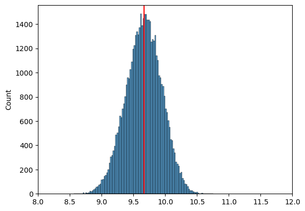
# generate 50000 samples from a normal distribution with E[X]=10 and standard deviation 1
n_samples = 50000
goose_samples = rng.normal(loc=10, scale=1, size=n_samples)
goose_samples.shape
sns.histplot(goose_samples);
sample = goose_samples[:10]
goose_mean = np.mean(sample)

# in reality, we don't have access to the "true" distribution, which is why it's commented out
#sns.histplot(goose_samples)
plt.axvline(x=goose_mean, color='red');
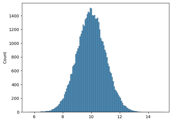
For bootstrap samples, we can use random.Generator.choice() with replacement to draw samples from our dataset.
bootstrap_means = []
n_bootstraps = 50000
for i in range(n_bootstraps):
# 1. draw a bootstrap sample
bootstrap_sample = rng.choice(sample, size=10, replace=True)
bootstrap_sample
# 2. compute our mean again, with the bootstrap sample
bootstrap_mean = np.mean(bootstrap_sample)
# 3. add our bootstrap_mean to the list
bootstrap_means.append(bootstrap_mean)
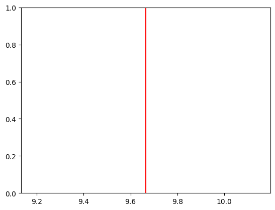
plt.axvline(goose_mean, color="red")
# as our n_bootstraps increase, we're able to see the spread of the estimate
sns.histplot(bootstrap_means)
# fix the xaxis
plt.xlim(8, 12);